Add links & media
Enhancing your Digital Catalogue with links and multimedia makes it a more engaging and interactive experience: magnify specific areas for a closer look, incorporate links, integrate products, and provide detailed descriptions and specifications.
Your Digital Catalogue goes beyond the basics of a standard PDF with flipping pages. It leverages images and media - key communication assets. With our Links & Media feature, you have the opportunity to enhance user engagement by supplementing your content with valuable additional information.
Interested to see how it can work for you? Let's explore!
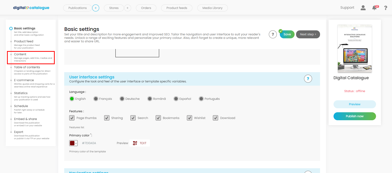
First access your Digital Catalogue.
Go to the left-side panel and click on Content.
You will be redirected to the list of pages from your Digital Catalogue. Click directly on the page or click on the 'edit' icon from the bottom menu. You will then enter the Links and Media section.
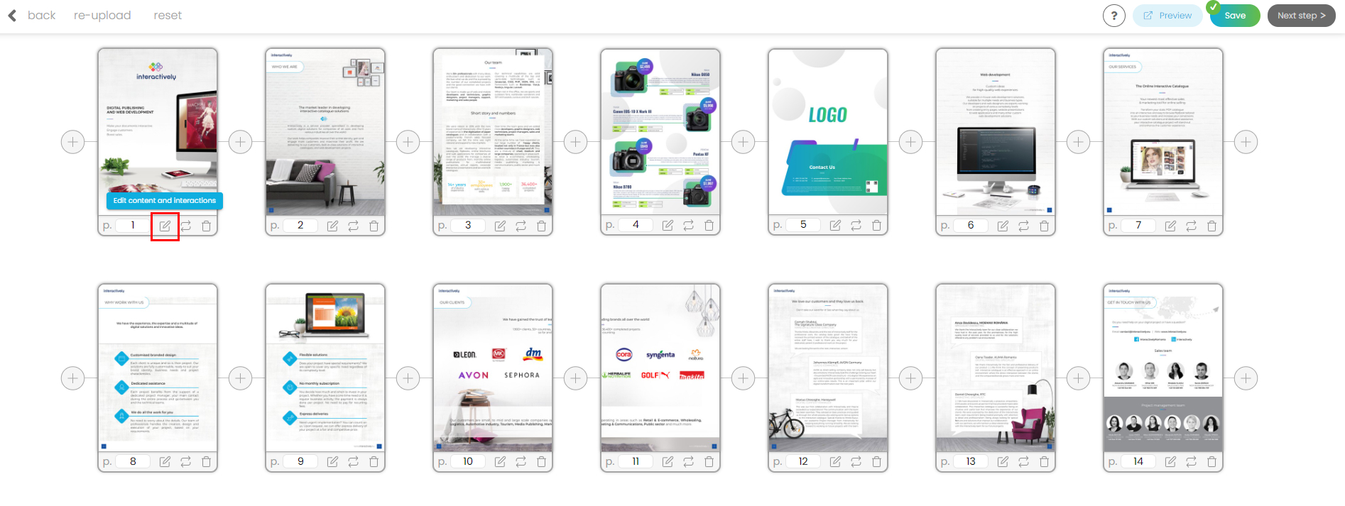
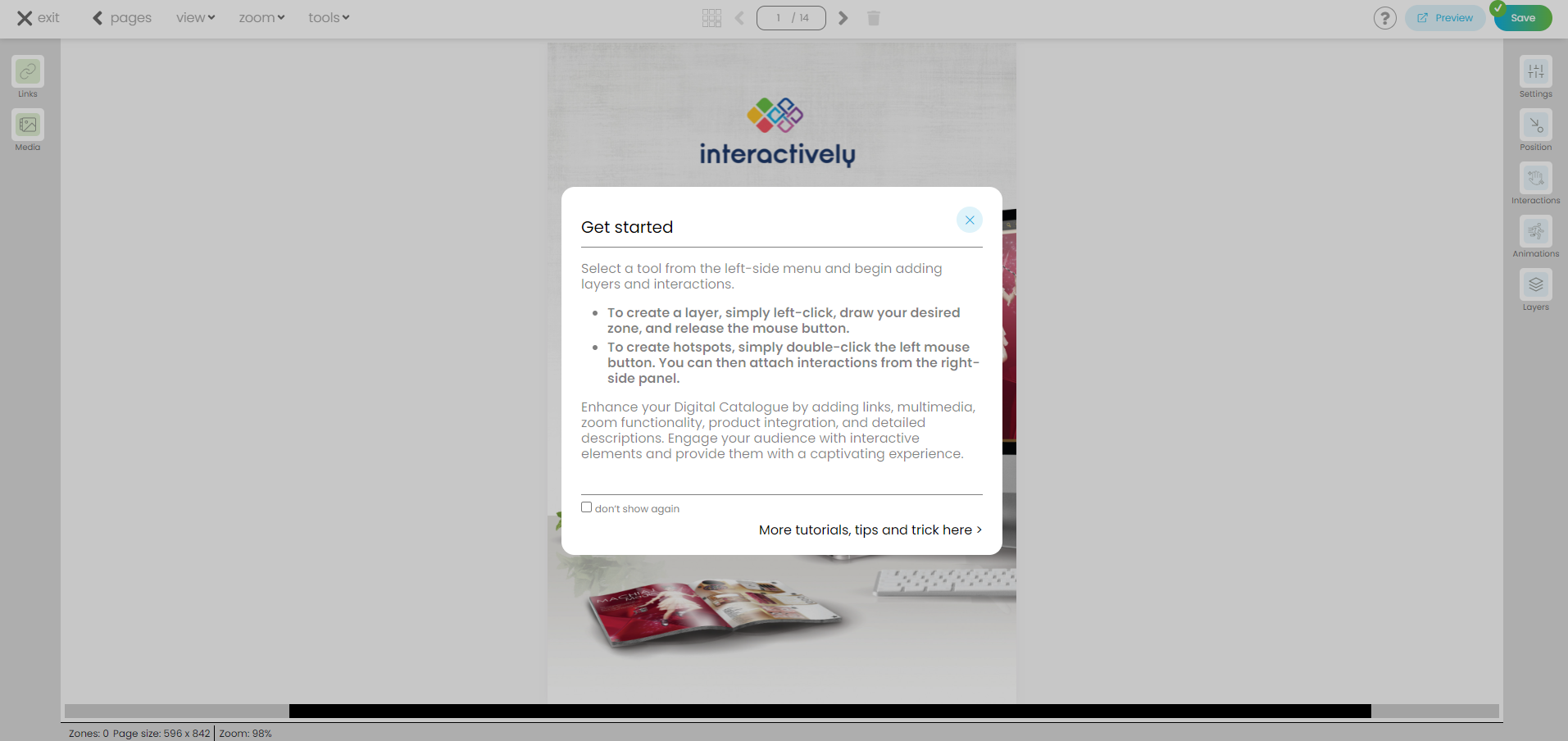
Check the tips popup and then start adding interactions.
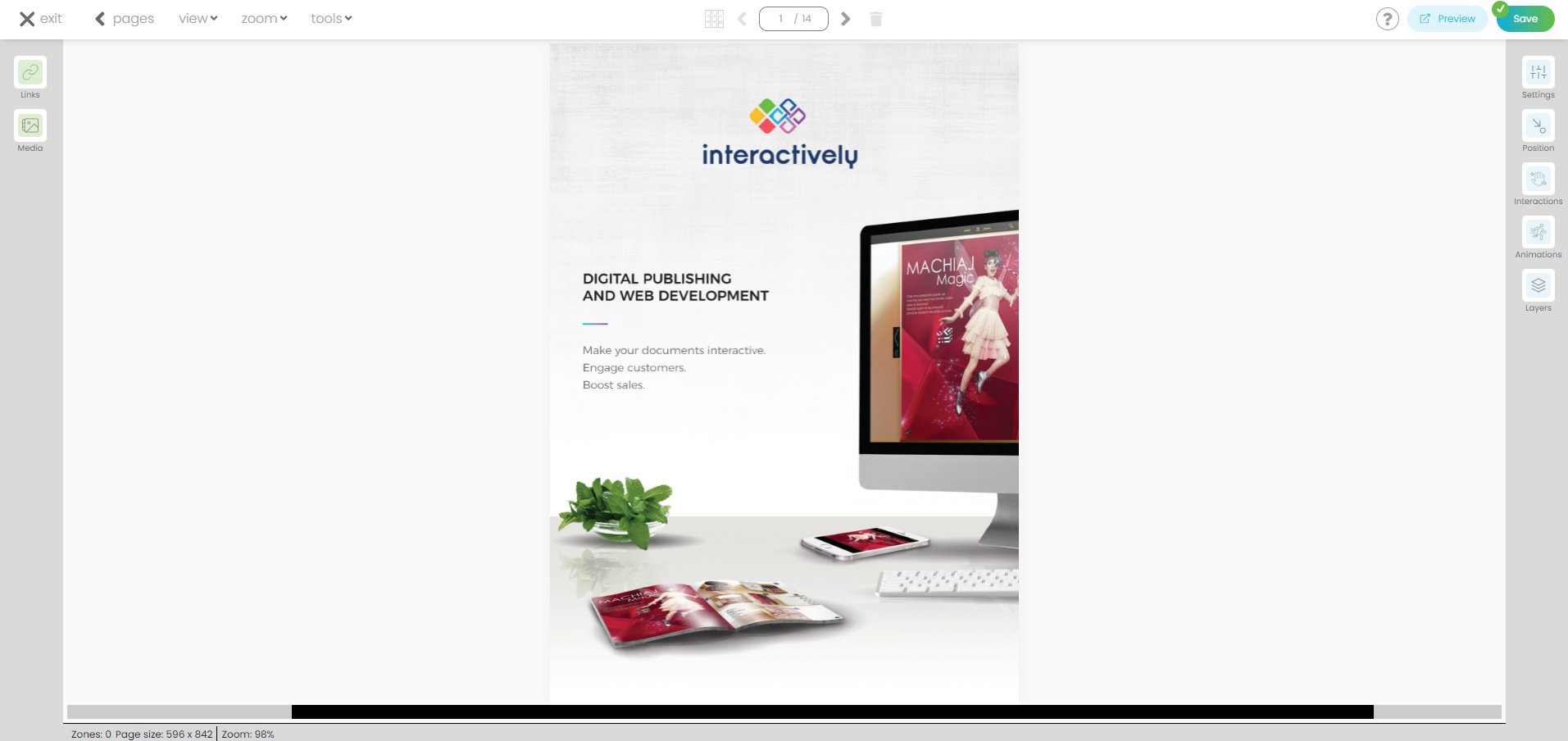
In the top left corner of the menu, you'll find multiple options.

- Exit. This option will take you back to the start screen.
- Pages. This option will take you back to the list of pages from your Digital Catalogue.
- View. Once you select a page you can choose its display type. You'll find these options in the View drop-down from the top menu: 'single page view' (standard display) and 'double page view.' You can also check the list of pages from your Digital Catalogue by clicking on the "all pages" option from the View section. Select a page and start adding interactions.
- Zoom. You can choose between various zoom ratios. "Fit to screen width" (standard display) and "fit to screen height" are also available. Try them all to see which one better suits your needs.
This is how the standard display looks like:
This is how the "fit to screen width" display looks like:

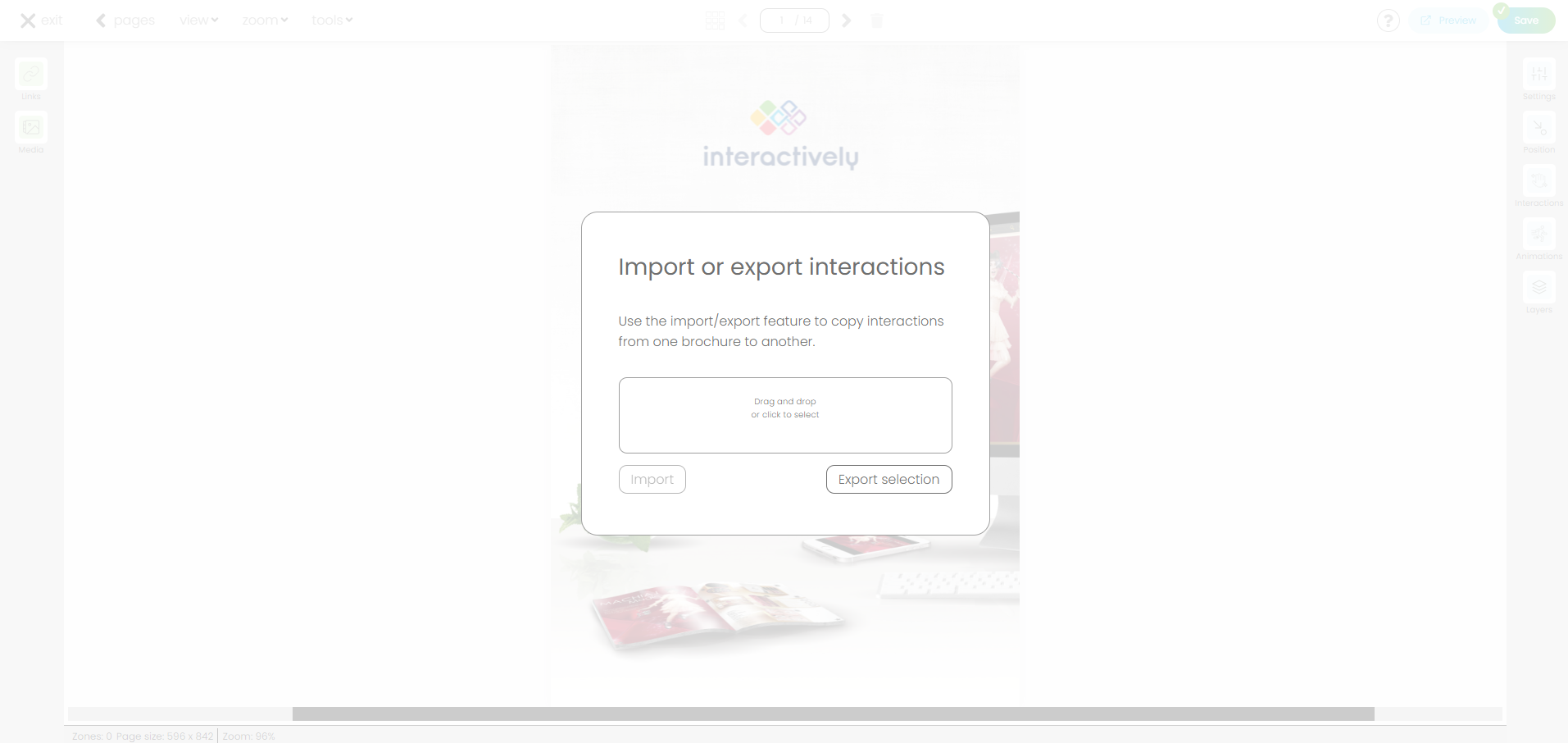
- Tools. In the Tools section there is one feature available - Import or export interactions. This feature enables you to copy interactions from one brochure to another. Once you click "Export selection" the file "maps.json" will be downloaded to your computer. You can then upload the “maps.json" file (by clicking “Tools” --> “Import/ export interactions “--> "Import") into a new brochure. Your layers and interactions are now copied into your new digital catalogue.
In the vertical menu, on the left side, two options are available: 1) Links and 2) Media. In the Links section you will find a list of all the available interactions.

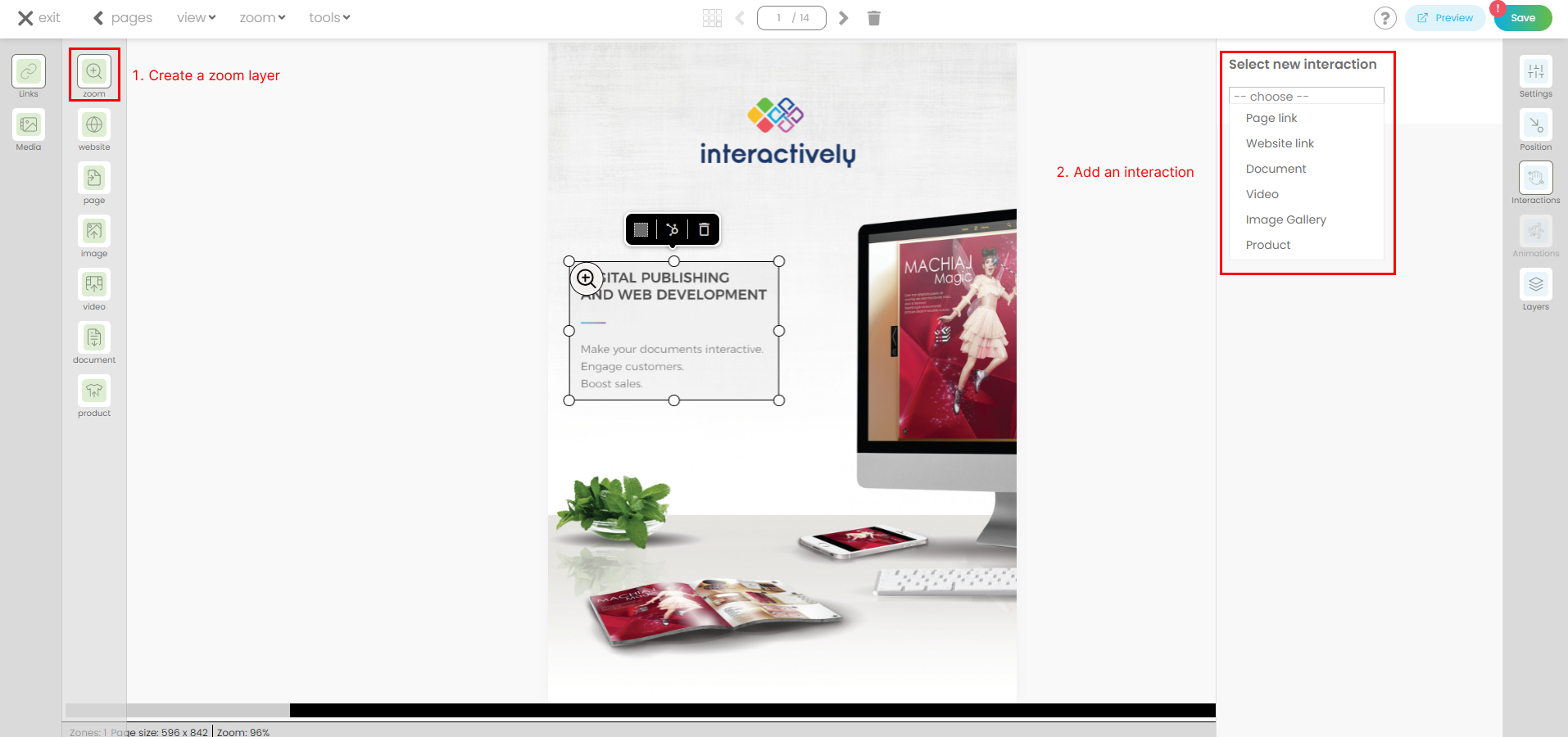
1) Click on Links then choose one of the options available:
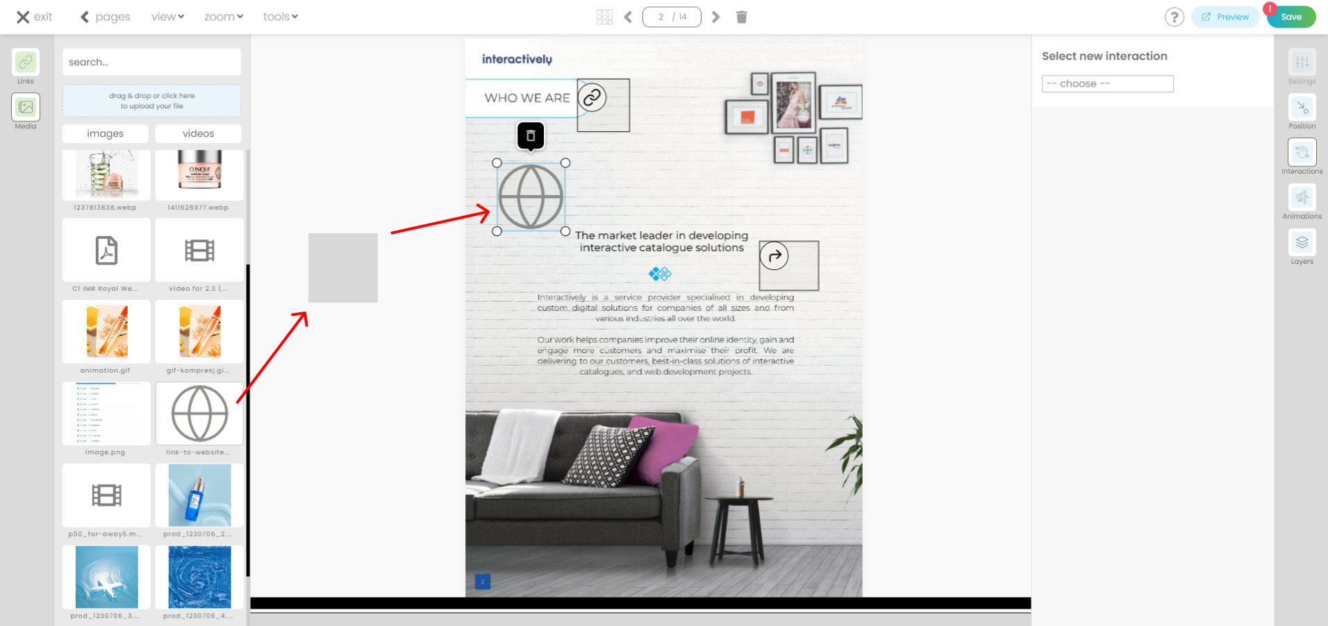
- The first option allows you to create a layer and then add an interaction from the right-side panel. To create a layer: left click, draw your zone and then release the mouse button. Once this operation is complete you will see on the right-side panel the list of interactions available. Choose the desired one and insert the required information (such as page number or web address), the hotspot will update to reflect the new changes. Additional details regarding all interactions can be found further down in this tutorial.
You can also use this feature to zoom in on a block of text or an image (available on Desktop only).
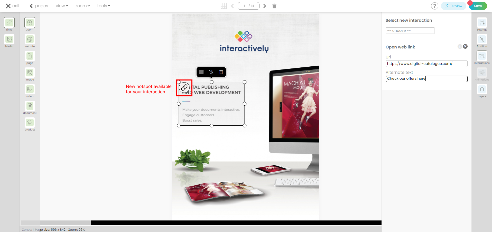
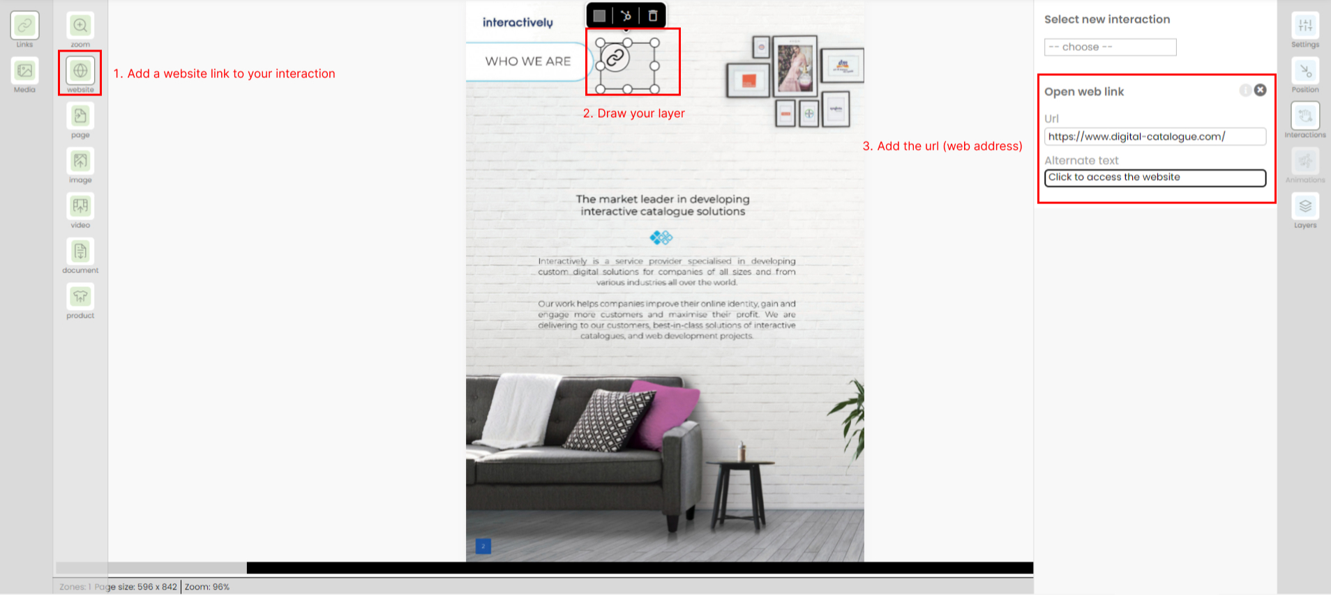
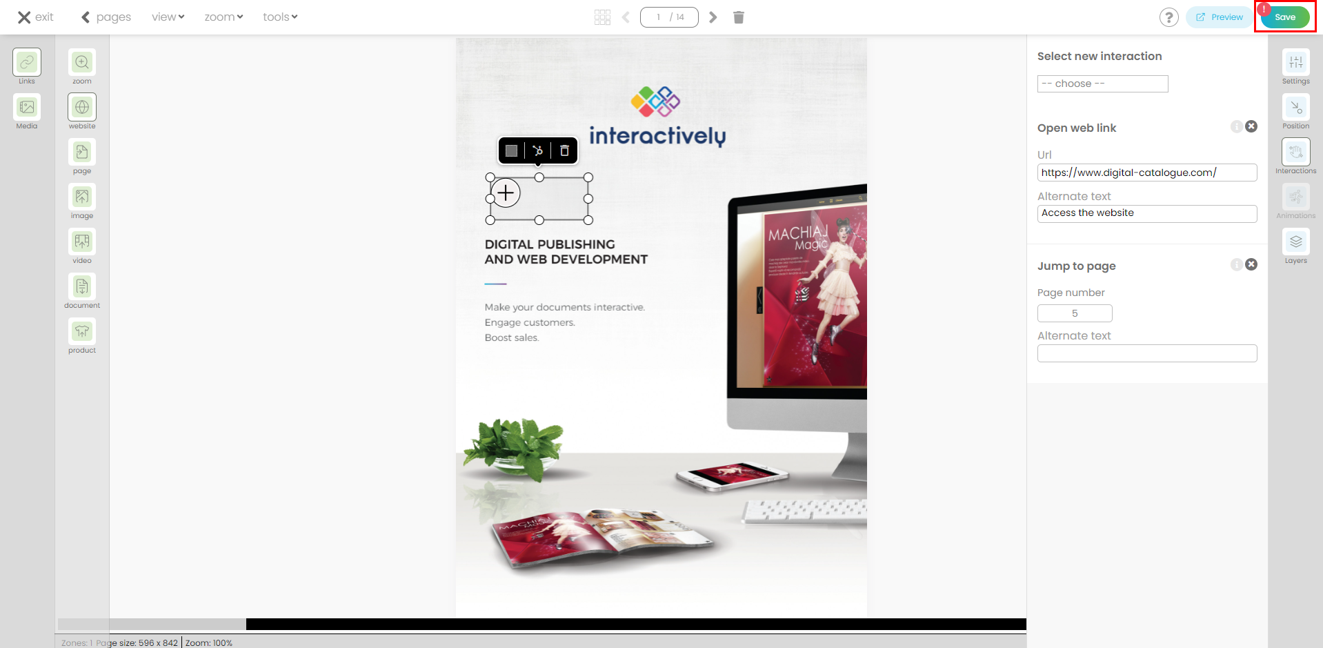
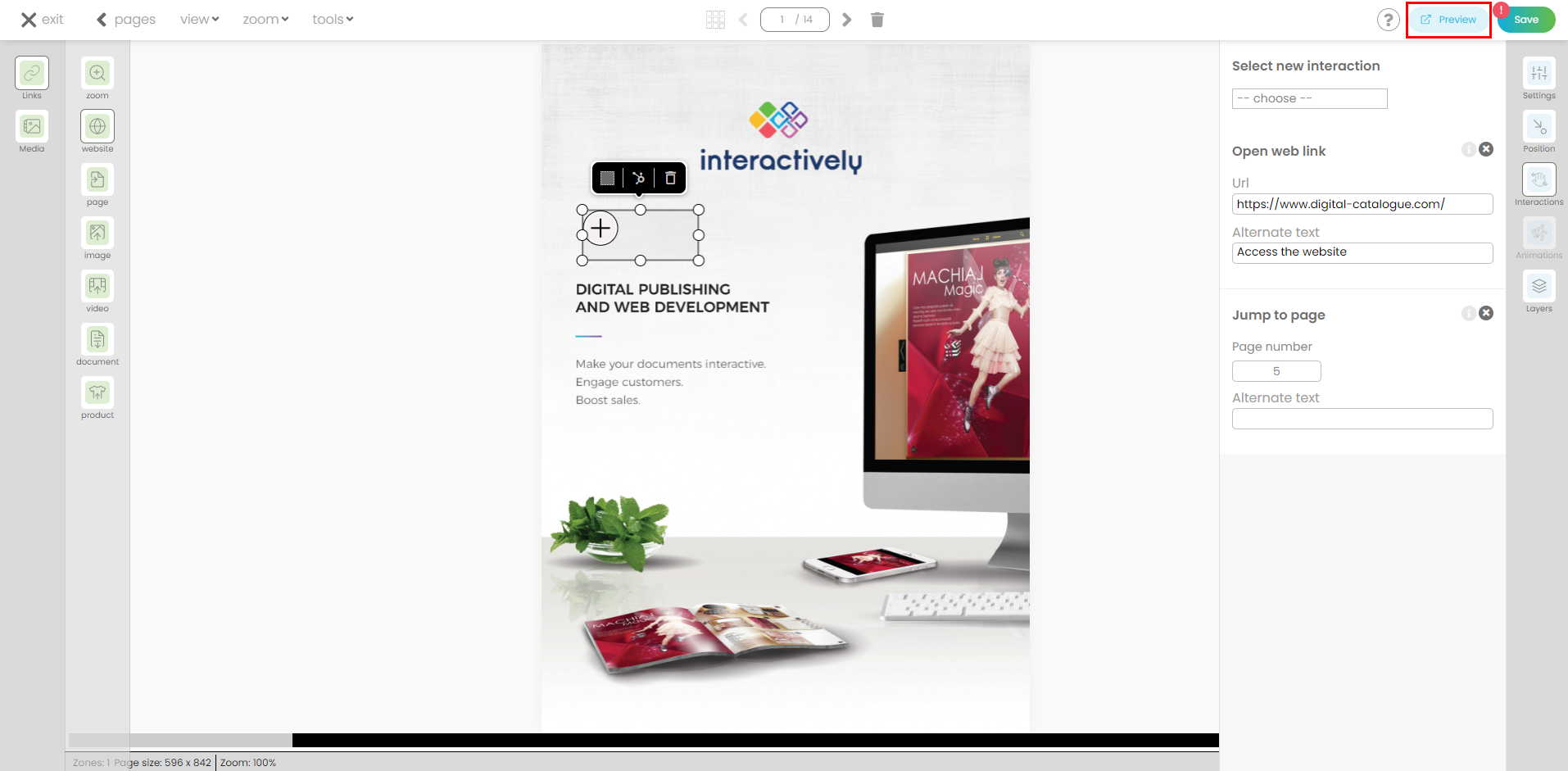
- Add a website link. Web links help users interact with your content and learn more about your products and services. You can link a product with its product page from your website.
Click on the Website link icon in the menu and create your layer. On the right-side panel, you'll find the predefined interaction (Website link) already attached, all you have to do is add the url (web address).
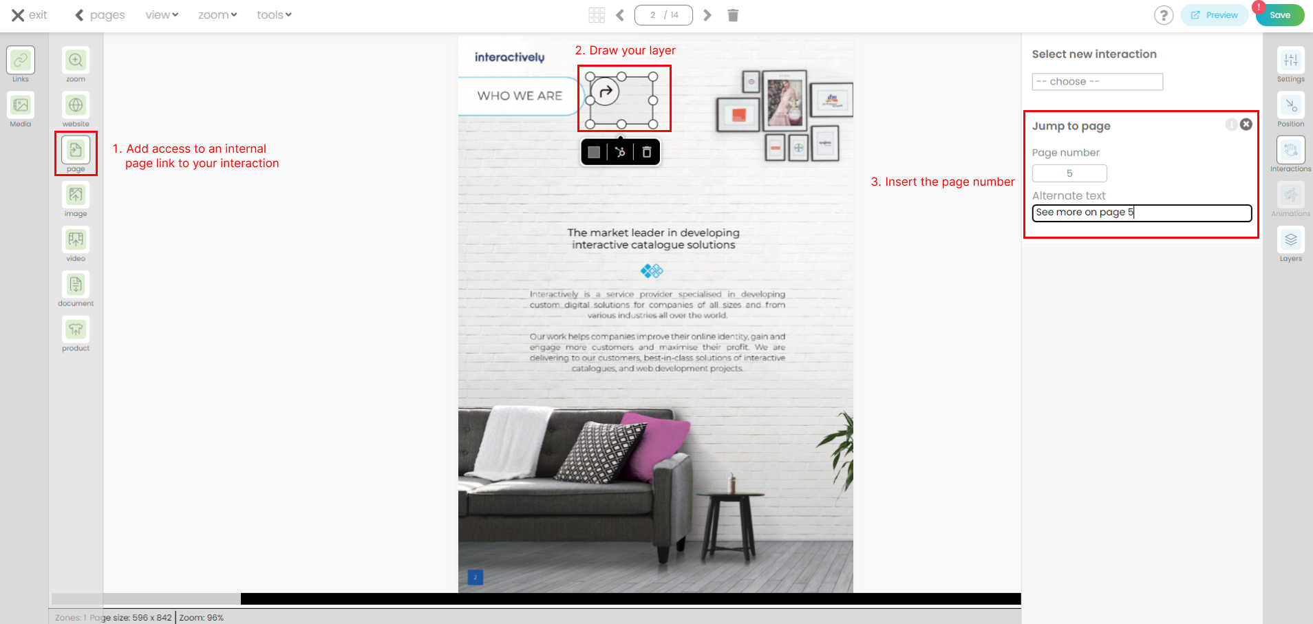
- To add an internal page link, simply create a reference to another page within the same Digital Catalogue. This is particularly useful if you want to link sections like a table of contents, found within your PDF file.
Click on Page link icon in the menu and draw your layer. On the right-side panel, you'll find the predefined interaction (Page Link) already attached, all you have to do is add the page number.
- Add a pop-up image gallery. Incorporating extra images can enhance the impact of your Digital Catalogue, attracting and engaging both users and potential customers effectively.
Click on the pop-up image gallery icon in the menu and create your layer. On the right-side panel, you'll find the predefined interaction (Pop-up image gallery) already attached, all you have to do is add your images.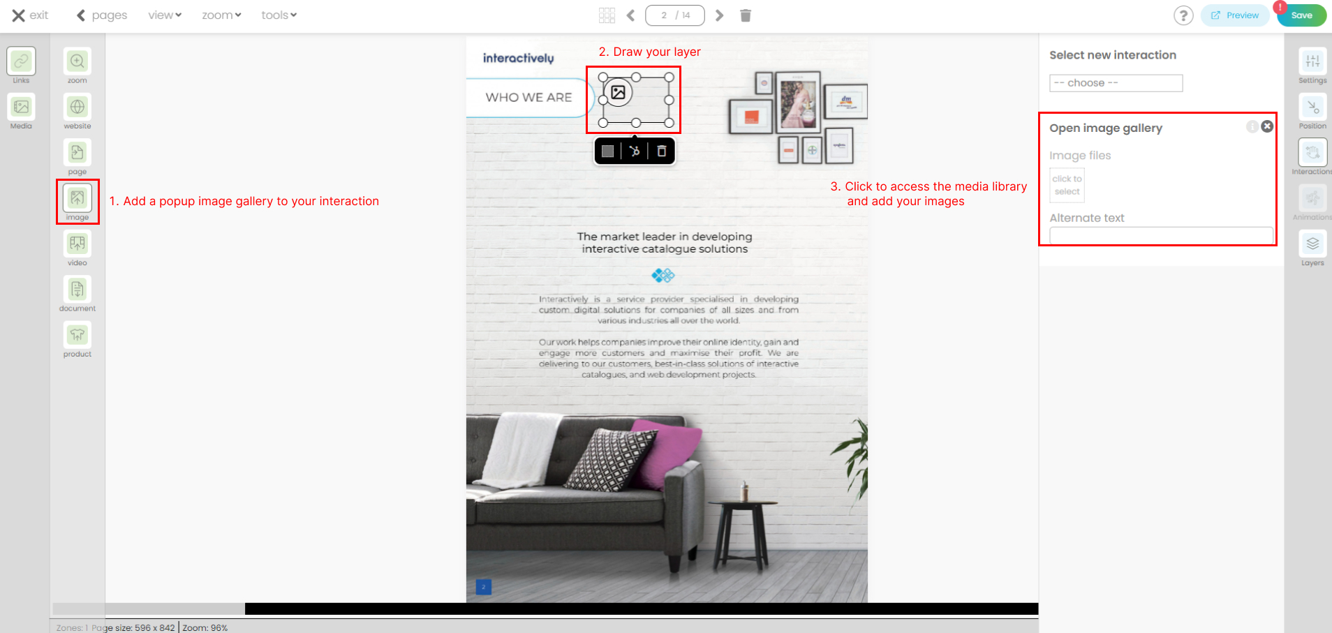
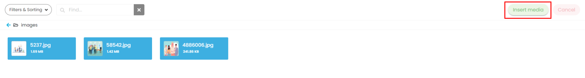
Once you click to add the images you will be redirected to your Media library where you can choose the files and upload them.

Choose your folder: Double-click on your desired folder. Next, single-click to select one image or hold CTRL while clicking to choose multiple images. Click Insert Media to proceed.
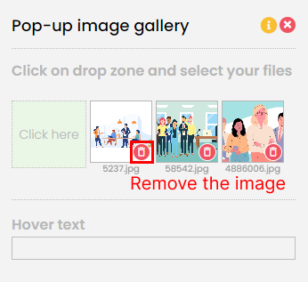
The image gallery is now attached.

You can remove the images attached by clicking on the bin icon.
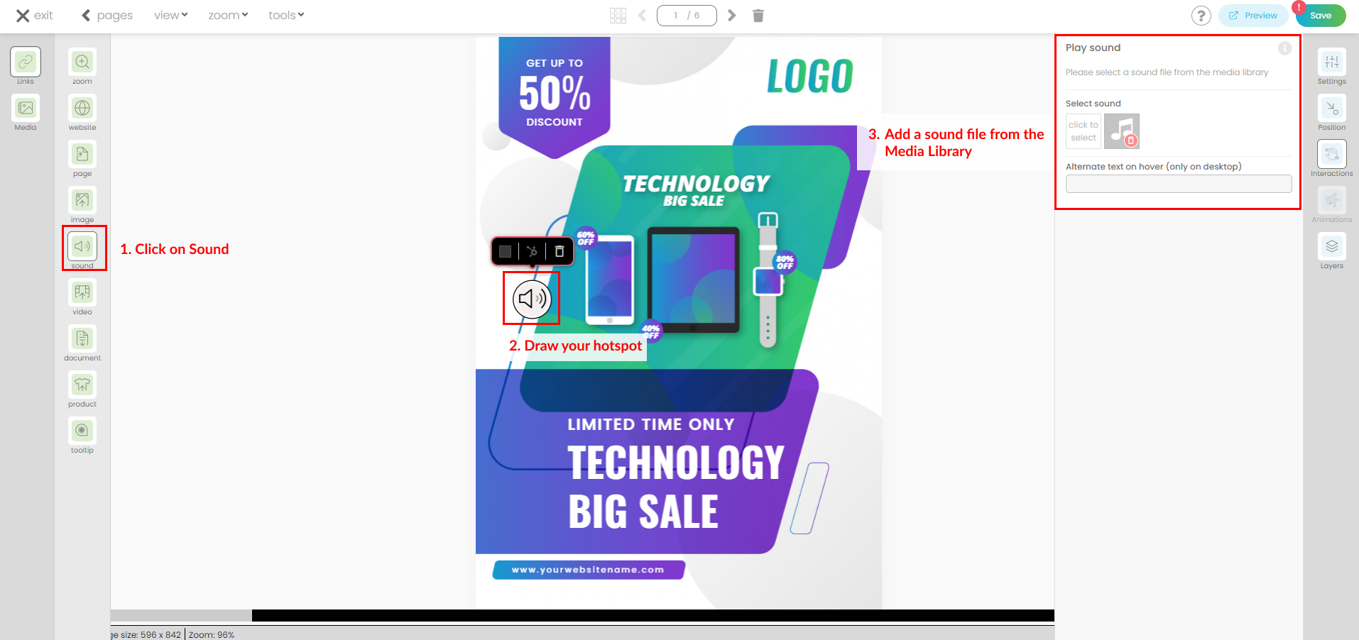
- Add a Sound link. This feature allows you to add audio elements from the Media Library (such as mp3, wav, and ogg) and play them on click/tap of an icon within the digital catalog.
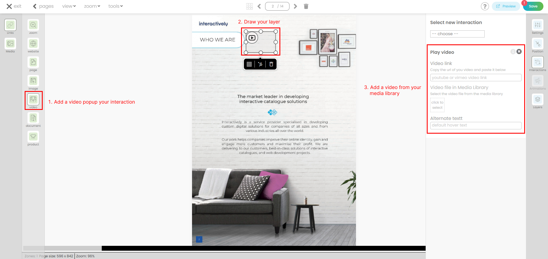
- Add a pop-up video link. Videos are compelling tools in digital marketing, and they can create strong connections with your online visitors. Use cases could include launching a video showcasing a product or service, or beginning your catalogue with the newest TV commercial. You can incorporate video links from YouTube or Vimeo.
Click on the pop-up video link icon in the menu and create your layer. On the right-side panel, you'll find the predefined interaction (Pop-up video) already attached. Two options are available:
1. Add a video url.

If the option Popup video player is toggled on, the video will play in a popup inside your Digital Catalogue.
If the option Open in a new tab is toggled on, then the user will leave the Digital Catalogue and the video url will open in a new window.
2. Add a video from your media library.
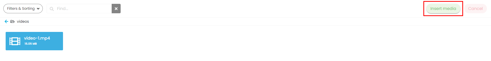
Once you click to add the video, you will be redirected to your Media library where you can choose your file and upload it. All video file formats are allowed.

Select your file, then click on Insert media.
The video file is now attached.

You can replace the video attached by clicking on the blue icon.

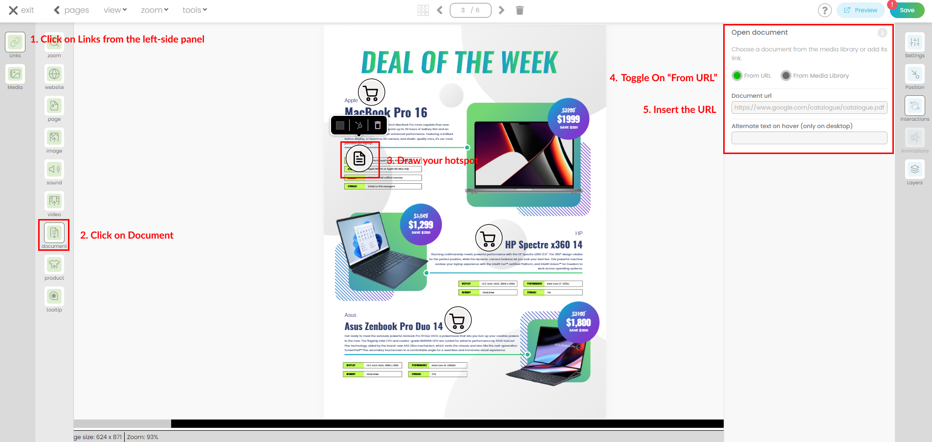
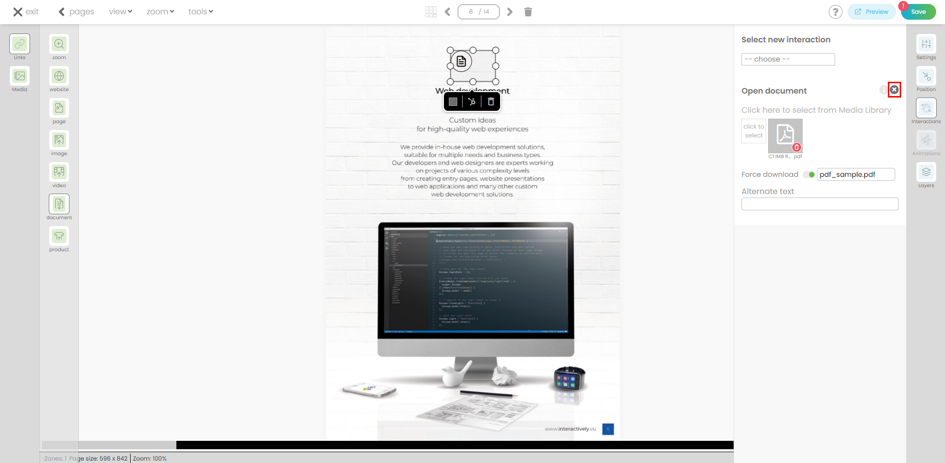
- Add a document link. You can insert additional pdf file or zip file.
Click on the document link icon in the menu and create your layer. On the right-side panel, you'll find the predefined interaction (Pop-up document) already attached.
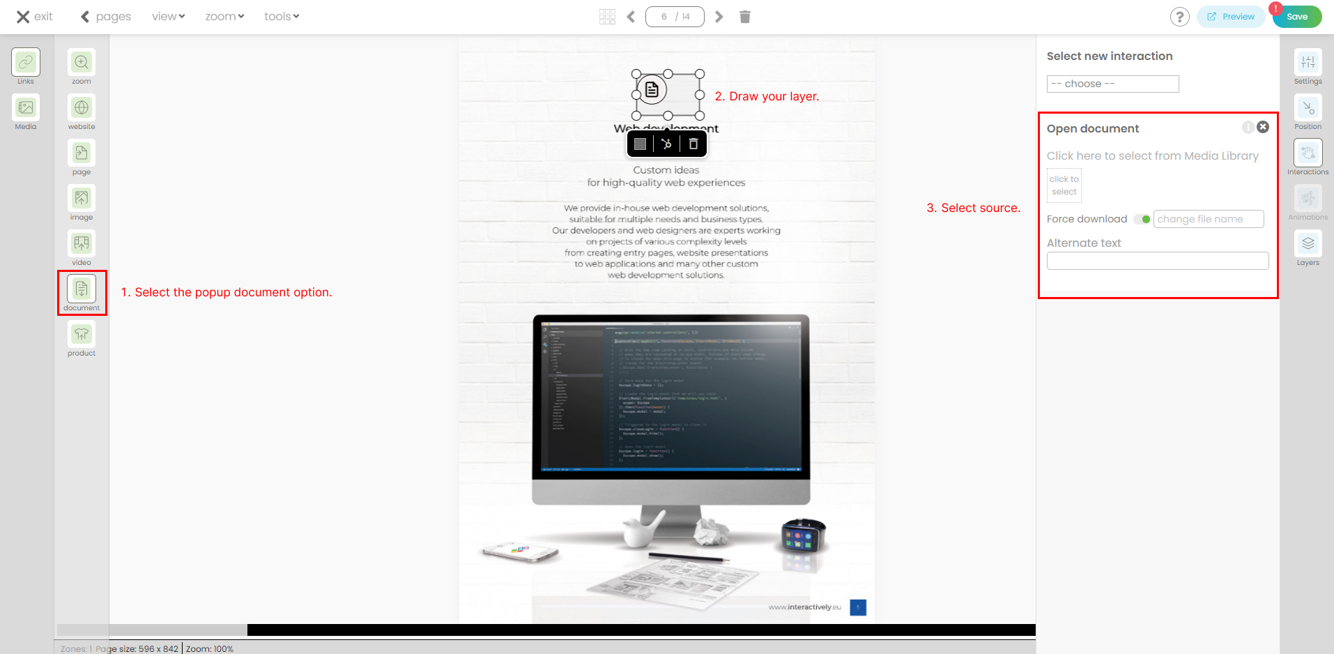
Once you click to add the document, you will be redirected to your Media library where you can choose your file and upload it.
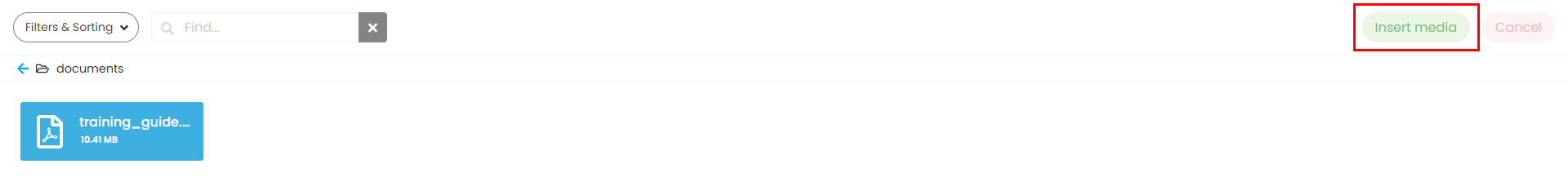
The document is now attached. Documents like PDFs can be viewed in a popup within the digital catalogue.
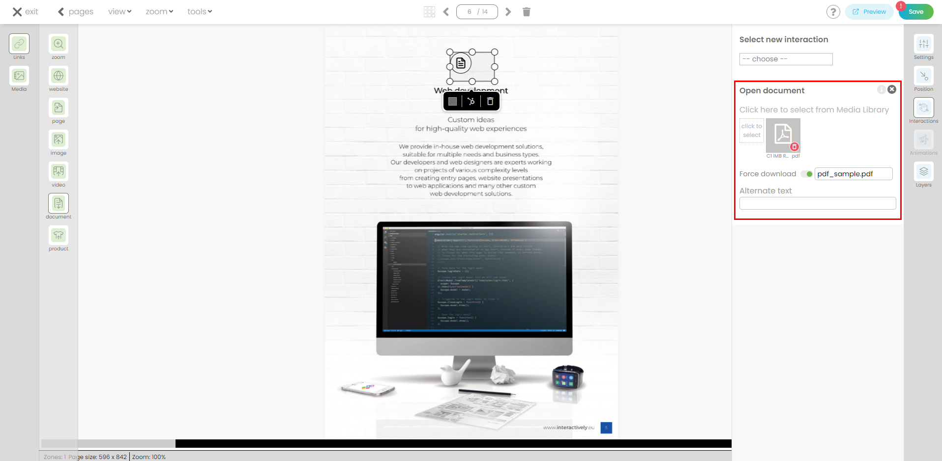
You can also open the document directly from a URl.
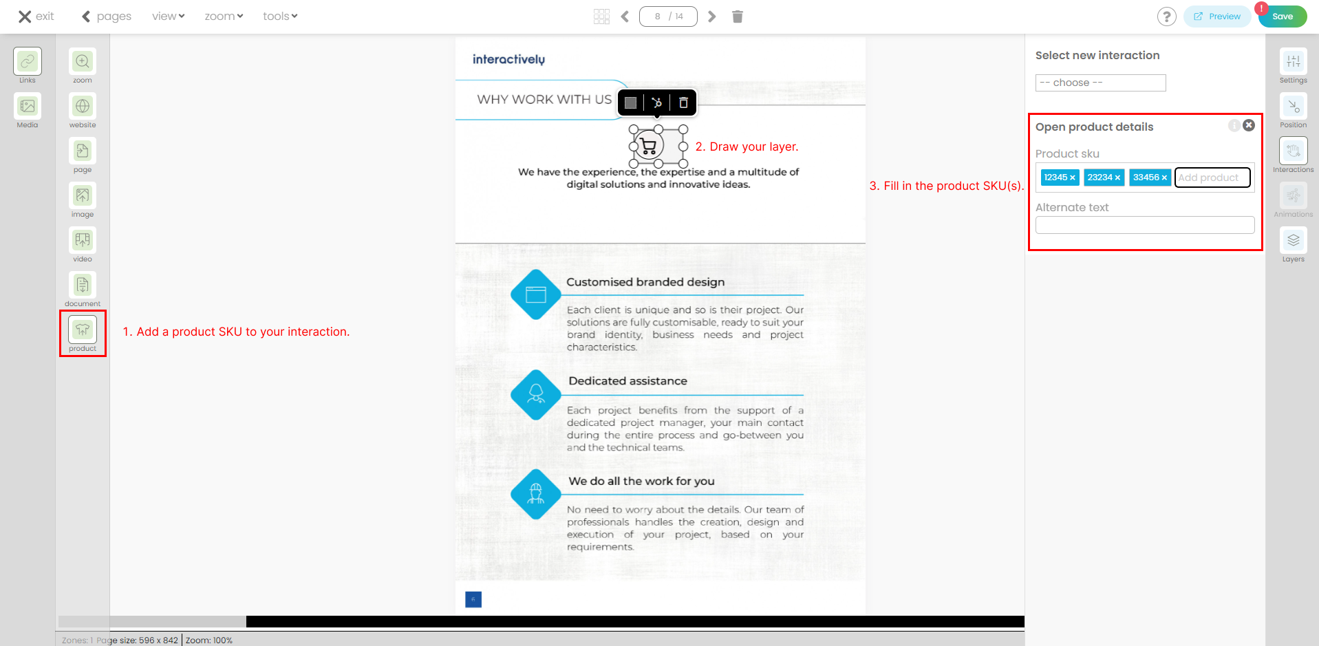
- Add a product SKU. This allows you to pull product details directly from your feed.
Click on the product SKU icon from the menu and create your layer. On the right-side panel, you'll find the predefined interaction (Product details) already attached. Fill in the input with the product id (sku) and our system will retrieve that content. Add as many SKUs as you need. Click enter after each one.
Please note: To perform this action, a feed file must be uploaded into your account.
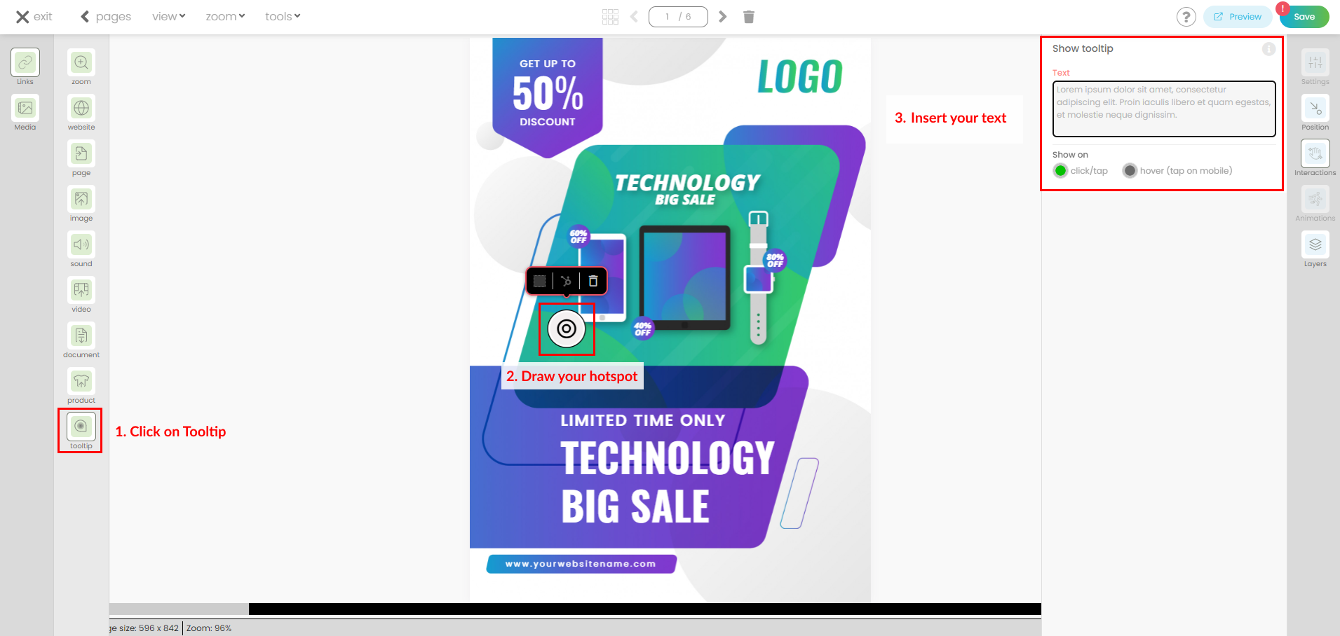
- Add a Tooltip. Designed to provide additional context or details about a specific element. Tooltips are ideal for bits of text that can be hidden to save space on the page but are easily accessible when the user needs them.
Additional information!
- To create a layer, simply left-click, draw your desired zone, and release the mouse button.
- To create hotspots, simply double-click the left mouse button. You can then attach interactions from the right-side panel.
- Press Shift and click on the layers for multiple selection. Click outside the selection if you want to deselect them.
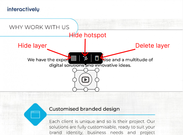
- Each layer has three options available: hide layer, hide hotspot and delete interaction.
If you hide the layer, the link attached remains available on the hotspot. If you hide the hotspot, the link attached remains available on the layer. The option delete interaction will completely remove your layer, the hotspot and the link attached.
- Each interaction can also be deleted from the right-side panel. This action will delete the interaction attached, but the layer will remain visible.
- Each interaction has a Hover text input that can be personalized. Fill in the text and it will be visible on desktop when the user moves the mouse over the interaction.

- Make sure you always save your changes.
- Feel free to utilize the preview mode to examine your progress up to this point.
Embedded features.
They allow you to insert extra content from the media library directly onto your page. Be it animated content like GIF files or videos, they enable your users to view this additional material without having to navigate away from the current page.
Simply drag and drop your file from the media library popup directly into the page. You can then resize it and add an interaction if needed.
Configure general preferences for your interaction.
In the vertical menu, on the right side, five options are available: Settings, Position, Interactions, Animations and Layers.
Each layer comes with a range of customizable capabilities that can be tailored to suit your specific requirements.
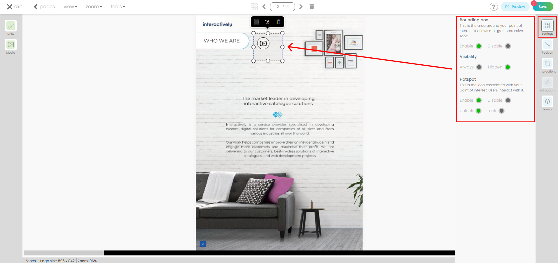
Settings
- Bounding box. This is the area around your point of interest. It allows a bigger interactive zone.
- Visible: if active, the layer will be displayed in your online Digital Catalogue. If inactive, the layer will not be displayed, but the interaction will remain attached.
- Disable: if active, the layer will be removed but the hotspot will remain attached.
- Hotspot. This is the icon associated with your point of interest. Users interact with it.
- Visible: if active, the hotspot will be displayed in your online Digital Catalogue. If inactive, the hotspot will not be displayed, but the layer will remain visible and the interaction attached.
- Lock hotspot: if active, the hotspot will have a fixed position inside the bounding box. If you want to change its position you need to unlock it first.
- You cannot disable both Bounding box (layer) and Hotspot at the same time.
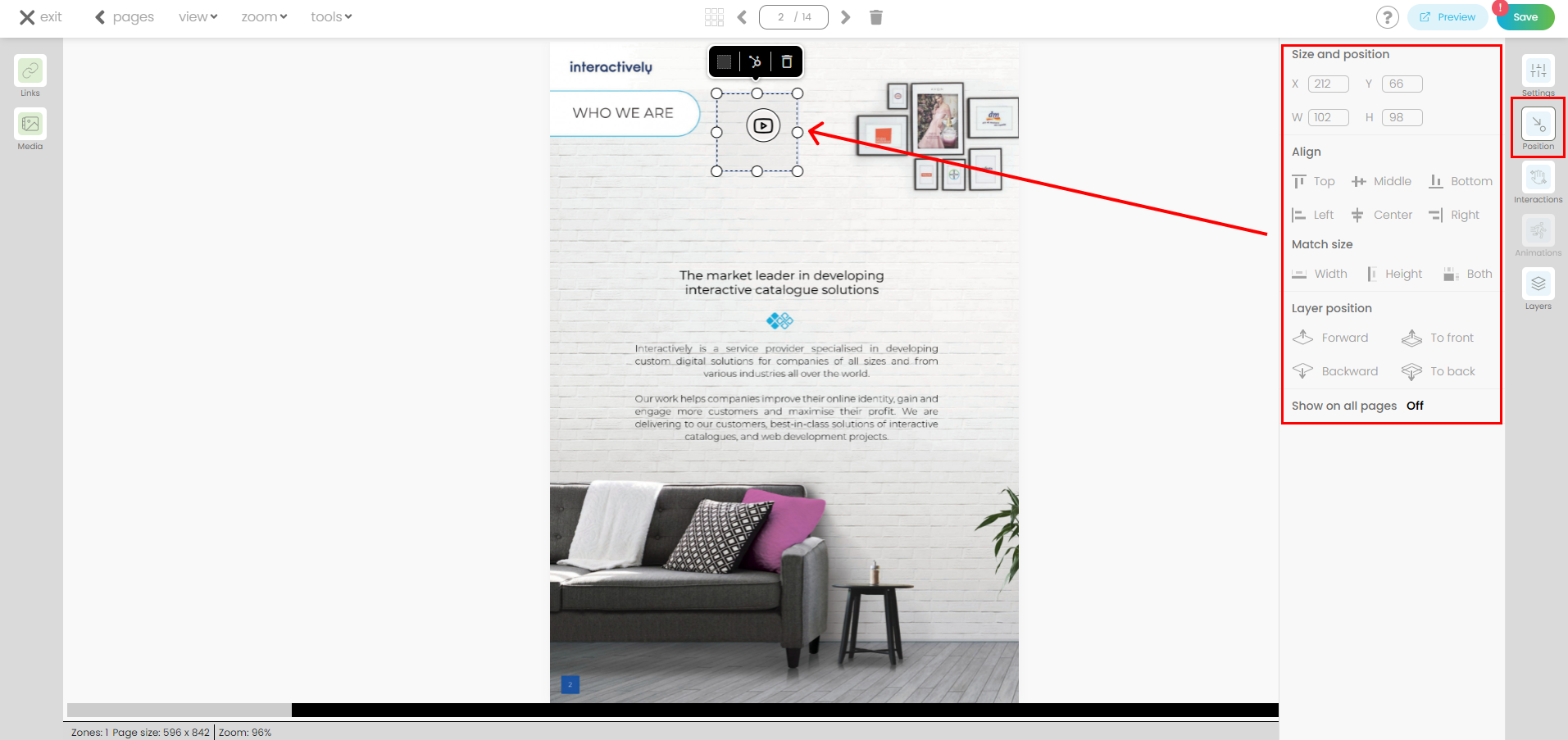
Position
- Size and position. It defines the position of your layer on the page. You have full control to adjust and update the coordinates as needed.
- X: Represents the horizontal coordinate
- Y: Represents the vertical coordinate
- W: Represents the width of the bounding box.
- H: Represents the height of the bounding box.
- Align. This attribute determines the appearance of the layer on the page. You can change its position by clicking on the available options: left, right, center, top, middle, bottom. You can also select more layers and align them as needed. Press Shift and then click on the layers to select them. The first one selected determines the position for the rest.
- Match size. This attribute allows you to fit your layer to match the page width, height or even both. You can apply this for a selection of layers as well (the first one selected determines the position for the rest).
- Layer position. You can change the z-index position for layers overlapping in the same page. You can prioritize the visibility of a layer by placing it "to front".
- Visibility. Show on all pages. If active (On) the layer and the hotspot will be replicated in all your pages at the same coordinates. They will be visible only in preview mode.
Interactions. It shows you the interaction already attached to your layer/hotspot. You can remove it or add new ones.

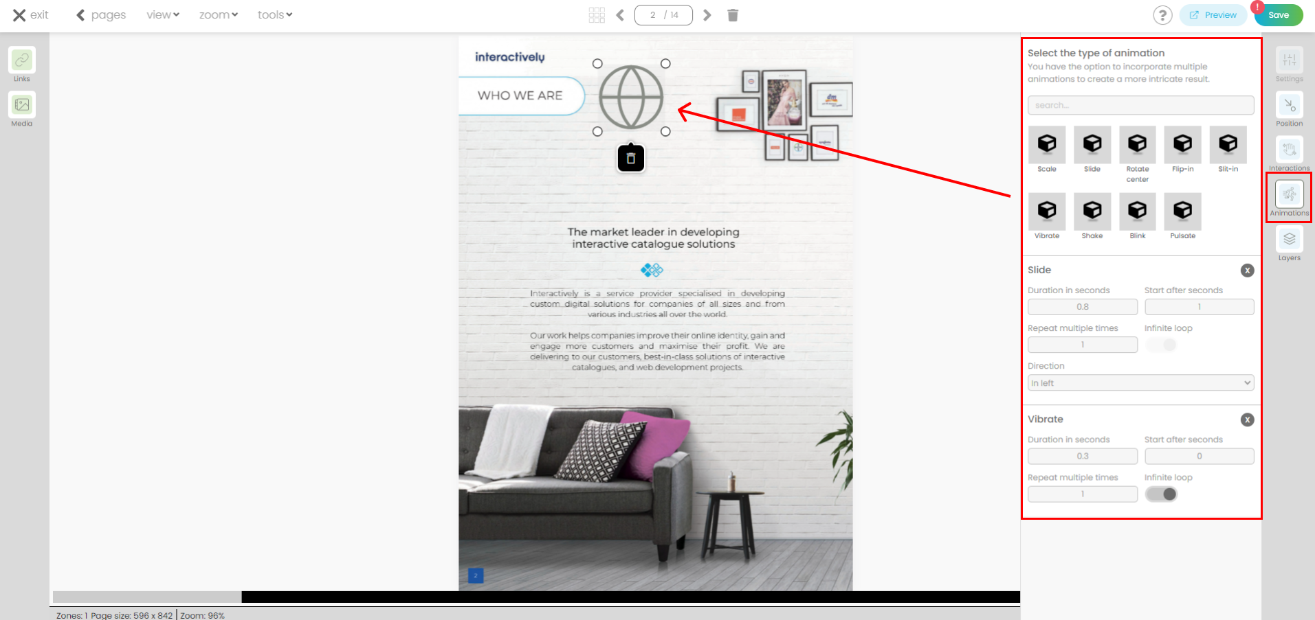
Animations. Are constrained to media-type elements within the platform. By incorporating a media element from the Media Library, such as a sticker, users can seamlessly integrate dynamic visual elements. First drag and drop the element on the page. Then choose from a variety of animation types and combine multiple effects to achieve desired results. Upon selecting an animation, a settings popup will prompt users to customize various parameters, allowing for precise adjustments tailored to individual project requirements.
Layers. You can view the list of all available layers on the page.
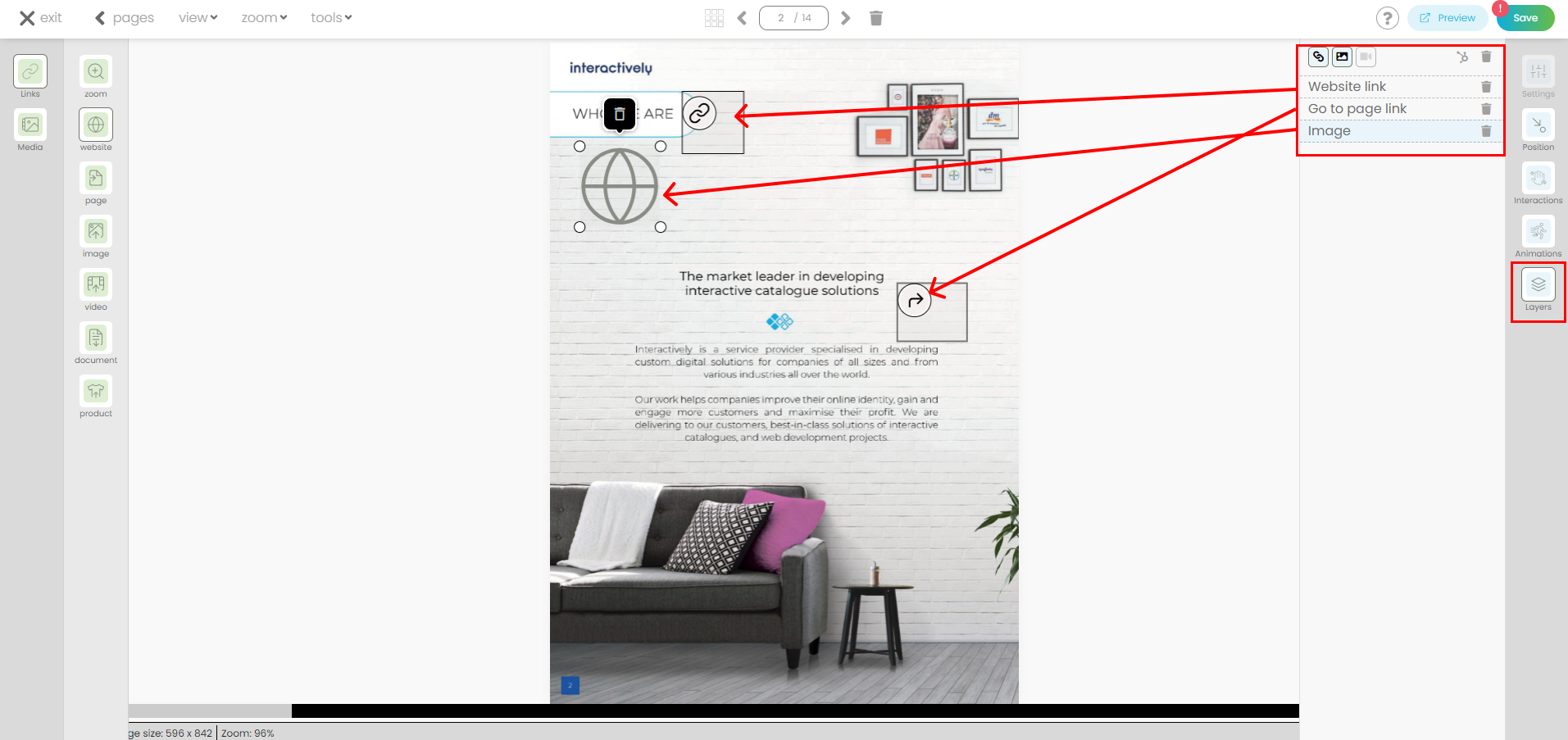
By clicking on a specific layer from the list, it will be highlighted on the page, allowing you to apply any desired changes or modifications using the options provided in the right-side panel. This gives you full control over the appearance and behaviour of each layer within your Digital Catalogue.
2) Media
To display the popup, simply click on the Media button from the left side menu.
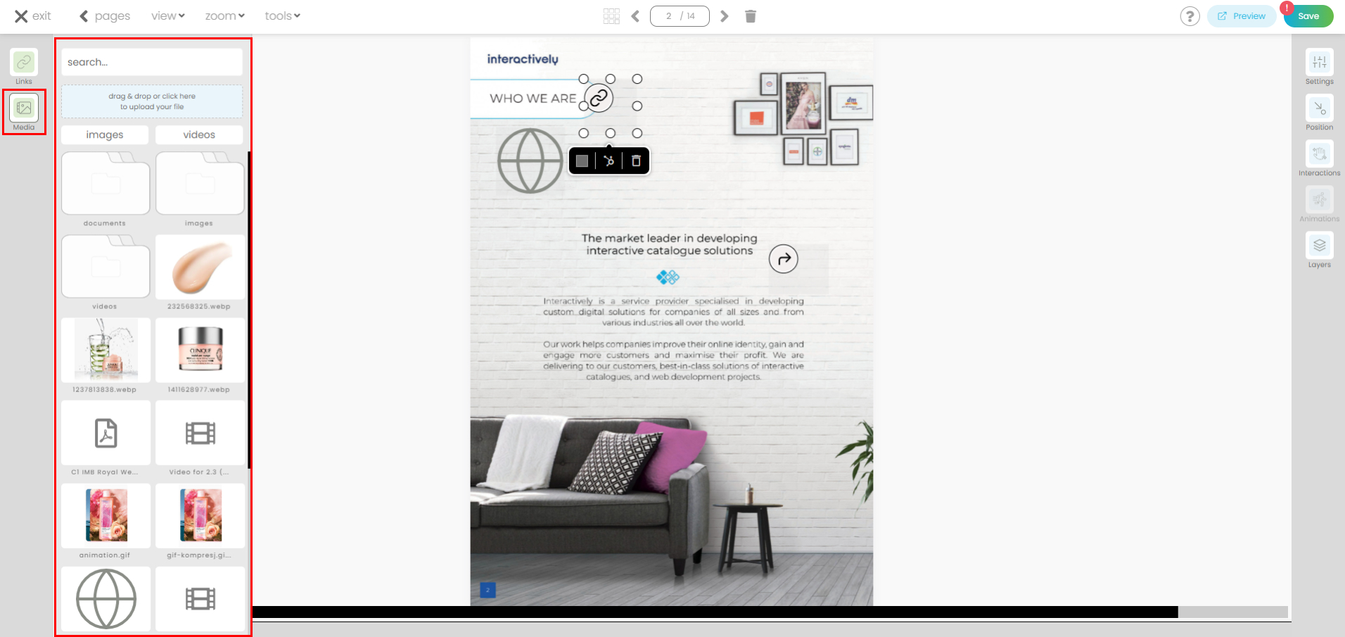
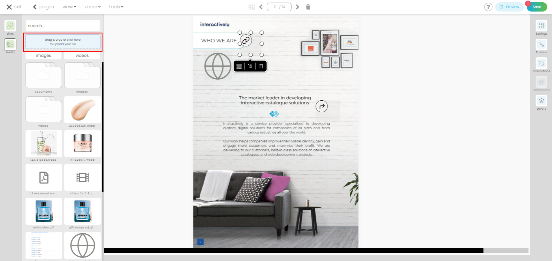
You can add new files to your Media library.
To add a media element on the page, simply drag and drop the file from the left-side menu.